Research artifact
Competitive benchmarking
I reviewed comparable heritage and trust websites to understand how they structured visit information, storytelling, and calls to action.
A concept UX case study exploring how information architecture and clarity can strengthen engagement for a heritage charity.

NDA-safe deep dive. Below is a detailed walkthrough of the design explorations, iterations, and UI solutions developed throughout the project.
To familiarise myself with the context of historical and heritage sites in the UK, I ran competitive benchmarking, reviewing how other trusts and charities structure their content, present events, and approach donations and volunteering.
I looked at what they prioritised above the fold, how quickly practical information could be found, and how storytelling was used to build credibility and engagement.
After understanding the space, I ran a series of usability tests to capture how people navigated the Trust’s existing site and what they expected to find. In the scenario, participants were planning a day visit and used the website to gather practical information beforehand.
The results pointed to a clear mismatch between what the Trust prioritised and what visitors needed first. Stakeholders wanted to spotlight events; visitors needed the basics before committing to anything.
Participants immediately searched for practical details (opening hours, directions, accessibility), but this information was buried low on the page, causing early frustration.
Visitors wanted historical context before visiting, but the website offered very little storytelling online (most context lived only onsite).
People were open to events, volunteering, and donations — but only after they felt informed and reassured.
Based on testing and synthesis, I identified a primary visitor archetype: a curious, culturally engaged person planning a short visit. They value heritage, but prioritise practical clarity before committing time or money.
Wants quick access to hours, directions, and accessibility details
Seeks context on why the site matters before visiting
Is open to volunteering/donating — after feeling informed and reassured
The redesign focused on rebalancing the information hierarchy. I prioritised practical visit information above the fold to reduce friction during early decision-making, while preserving mission messaging and event visibility further down the page.
By grouping related content and clarifying navigation, the homepage supports both immediate planning and deeper exploration.
Clarity before persuasion
Information before engagement
Trust as a prerequisite for participation
Research artifact
I reviewed comparable heritage and trust websites to understand how they structured visit information, storytelling, and calls to action.
Key screen
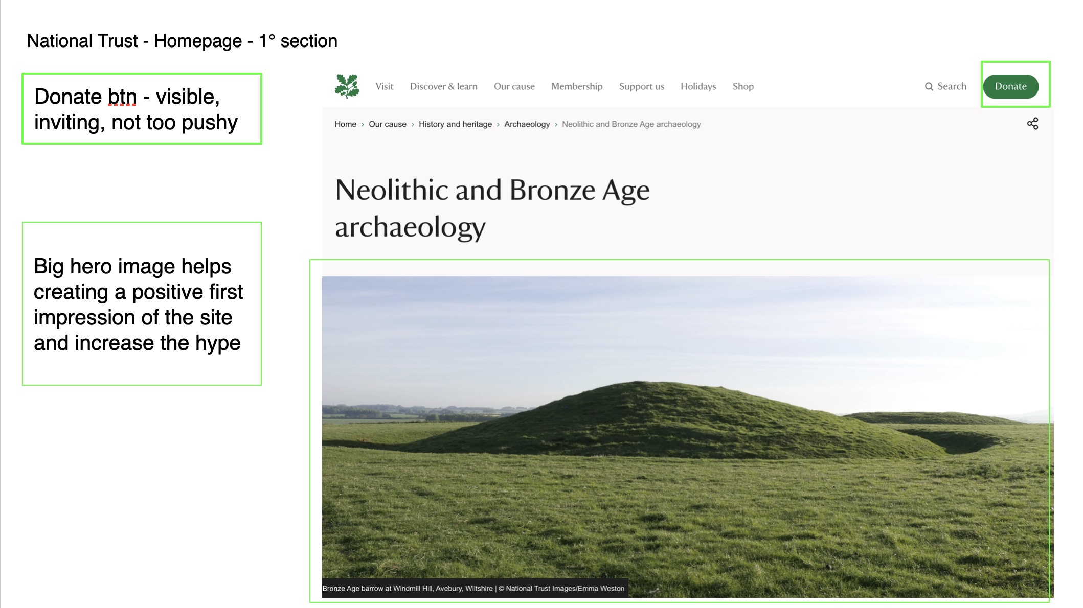
I redesigned the homepage to surface visit-critical information earlier, making it easier for first-time visitors to find practical details before engaging with events, donations, or deeper content.

Key screen
I defined a primary visitor archetype to keep the redesign focused on practical planning needs, early clarity, and gentle progression into deeper engagement.

Prototype
This prototype demonstrates the revised structure, clearer visit planning flow, and stronger content hierarchy across the experience.