Process artifact
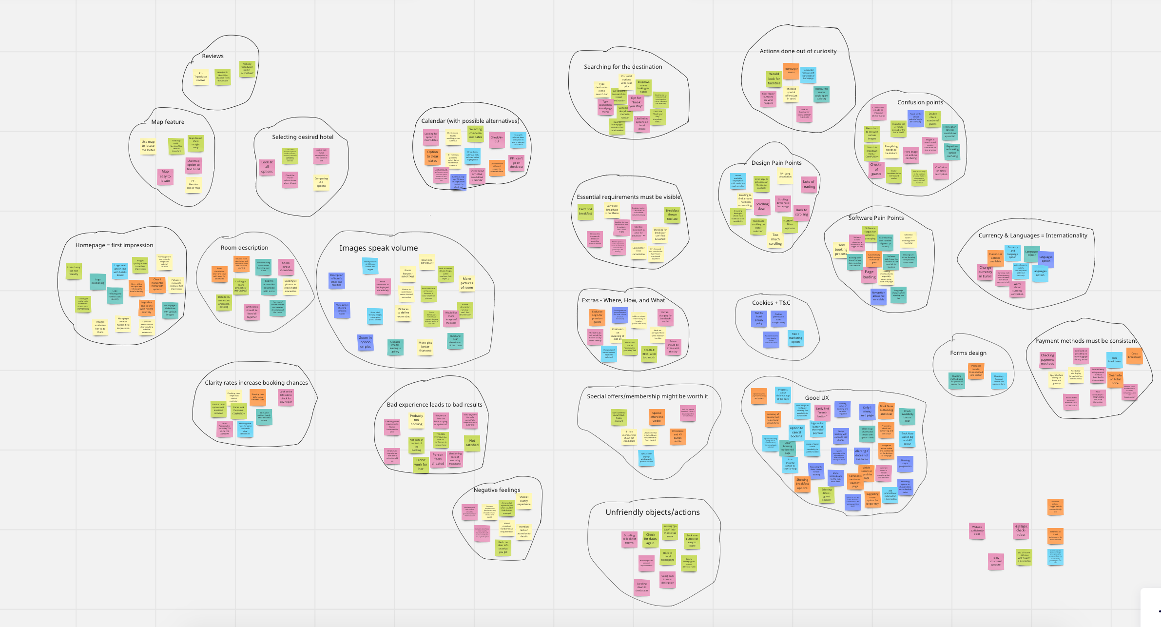
Affinity mapping
I used affinity mapping to organise patterns from research and testing, making it easier to identify where hesitation accumulated across the booking journey.
A concept UX case study focused on decision-making, clarity, and reassurance in high-stakes flows.

NDA-safe deep dive. Below is a detailed walkthrough of the design explorations, iterations, and UI solutions developed throughout the project.
The target audience consisted of travellers aged 30–60 who value comfort and quality and are willing to spend more when the experience feels reliable and thoughtfully designed.
They approach booking with a mix of excitement and caution: eager to plan, but sensitive to uncertainty around pricing, policies, and what is truly included.
Defining insights from research:
Users seek reassurance early, especially around cancellation policies and total price
Long descriptions and dense layouts increase hesitation rather than confidence
Photos, reviews, and summaries strongly shape trust and decision-making
Research phase
To familiarise myself with hotel-booking patterns and hospitality platforms, I ran competitive benchmarking, analysing how other businesses surfaced critical information and guided users through booking decisions.
In parallel, I conducted usability tests to understand where friction emerged, how uncertainty built over time, and which moments triggered hesitation or second-guessing.
Four recurring themes came up across participants:
Users rely on different methods to complete tasks (e.g., typing dates vs. using a calendar).
Remembering selections prevents repetition when navigating back and forth.
Essential details (price, cancellation, breakfast) should be visible early.
Long room descriptions discourage reading; users prefer scannable summaries.
Icons/visual cues improve comprehension of amenities and features.
Photos, maps, and reviews strongly influence trust and decisions.
Visuals help users judge room size and quality before committing.
Add-ons should appear after room selection — earlier feels pushy or misleading.
Relevant add-ons perform better than generic bundles.
A clear summary page is critical for reassurance before confirming.
Synthesis & insights
To make sense of the findings, I organised observations into an affinity diagram. This helped surface behavioural patterns, cluster pain points, and highlight design opportunities that could meaningfully improve the booking experience.
People complete tasks differently; multiple pathways reduce friction.
State retention prevents frustration when comparing or revisiting choices.
Policy and price certainty drive confidence early.
Scannable content beats completeness at decision moments.
Visual cues reduce reading load and ambiguity.
Trust is built through photos, reviews, and summaries.
Visuals help users make “mental simulations” of the stay.
Timing matters — add-ons belong after the core decision.
Relevance improves acceptance and reduces “upsell fatigue.”
Reassurance at the end prevents last-minute doubt.
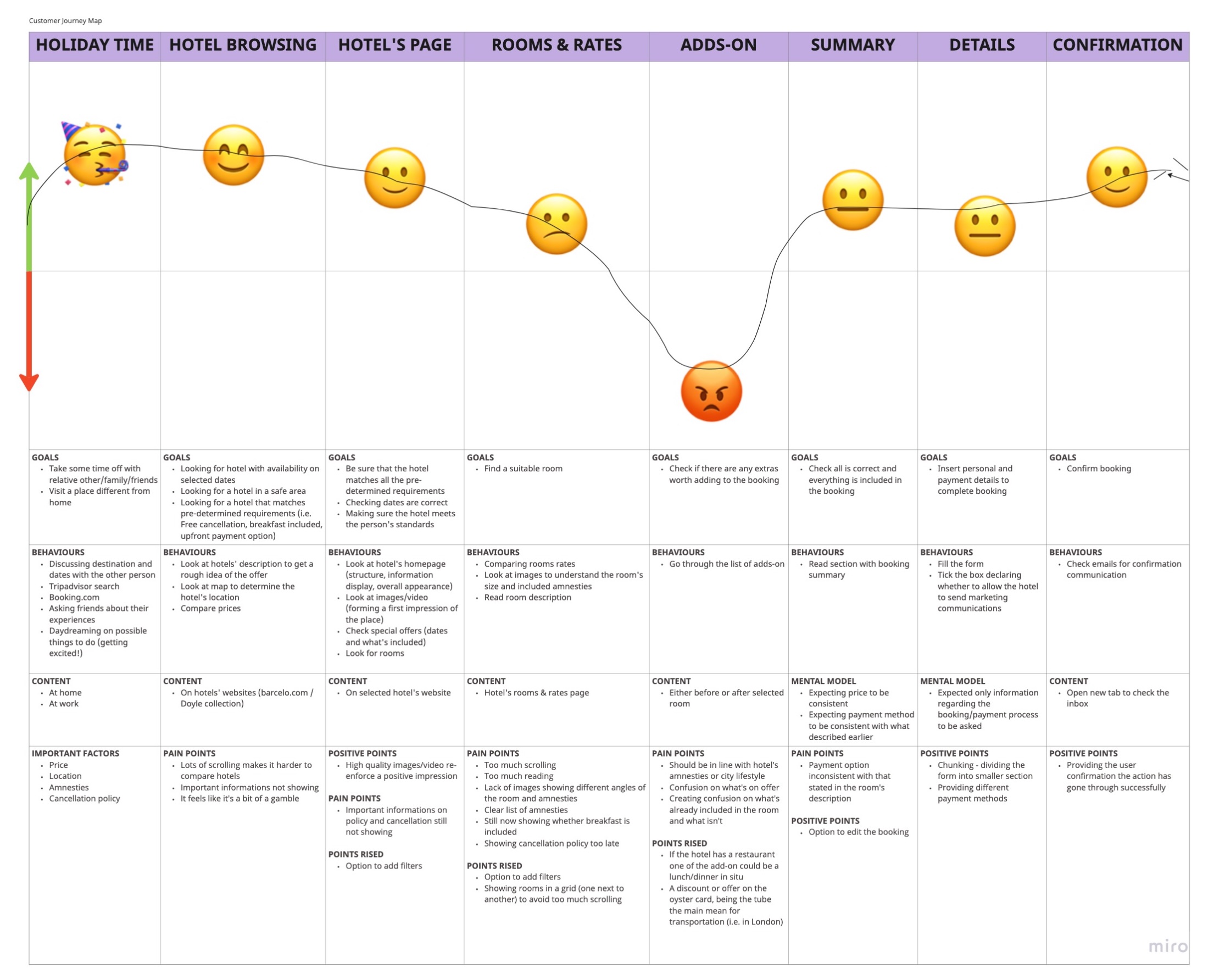
Journey mapping & experience gaps
Mapping the journey revealed how friction compounds over time rather than appearing in isolation. Although the biggest pain point showed up at add-ons, frustration had already been building earlier: excessive scrolling, dense descriptions, and key details hidden in secondary areas created repeated micro-moments of doubt.
By the time users reached add-ons, that hesitation had intensified. Even after completing the booking, some users described a lingering feeling that something might still go wrong.
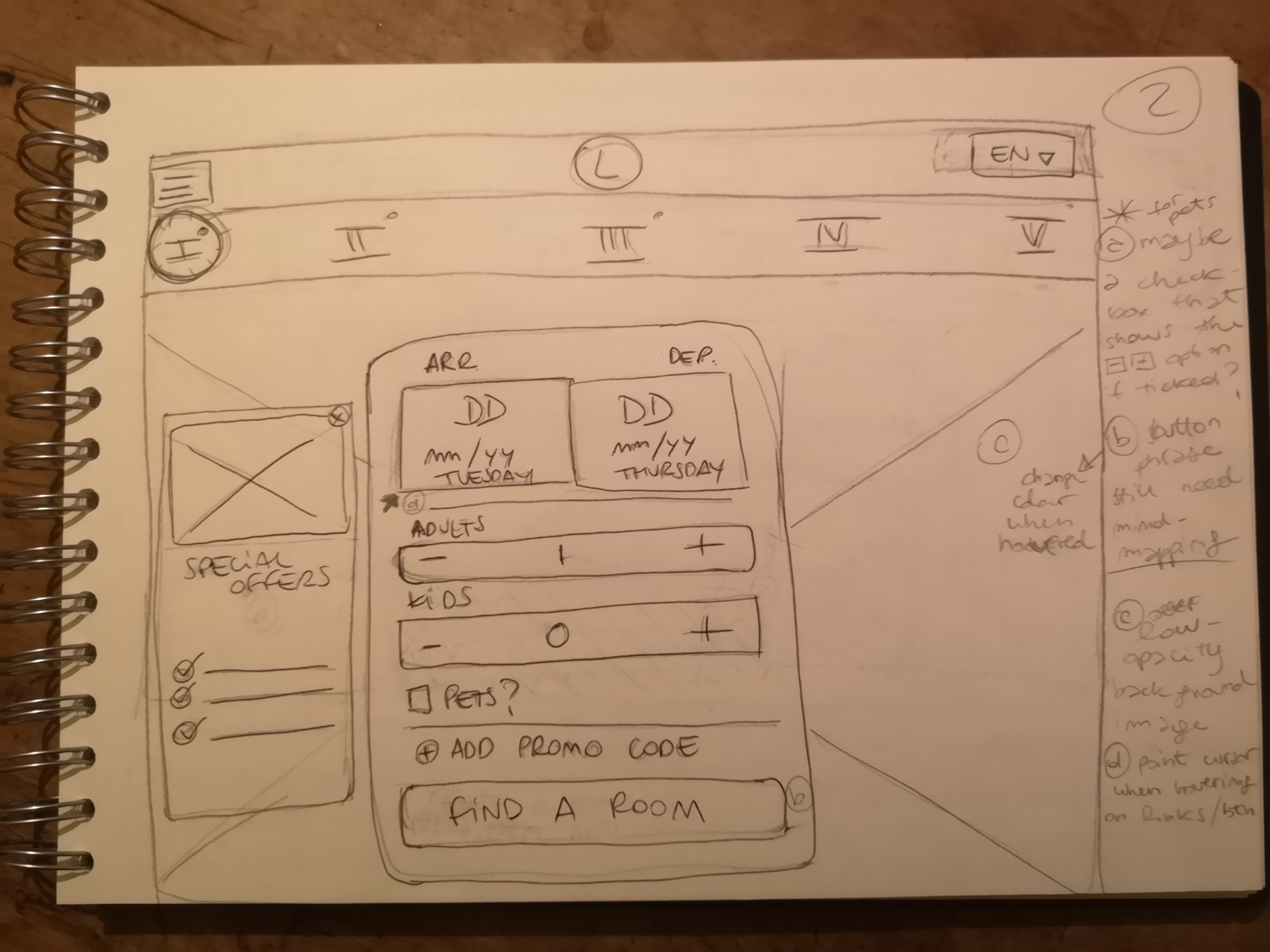
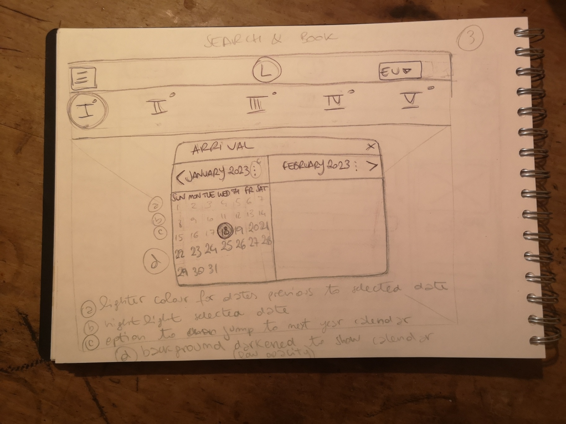
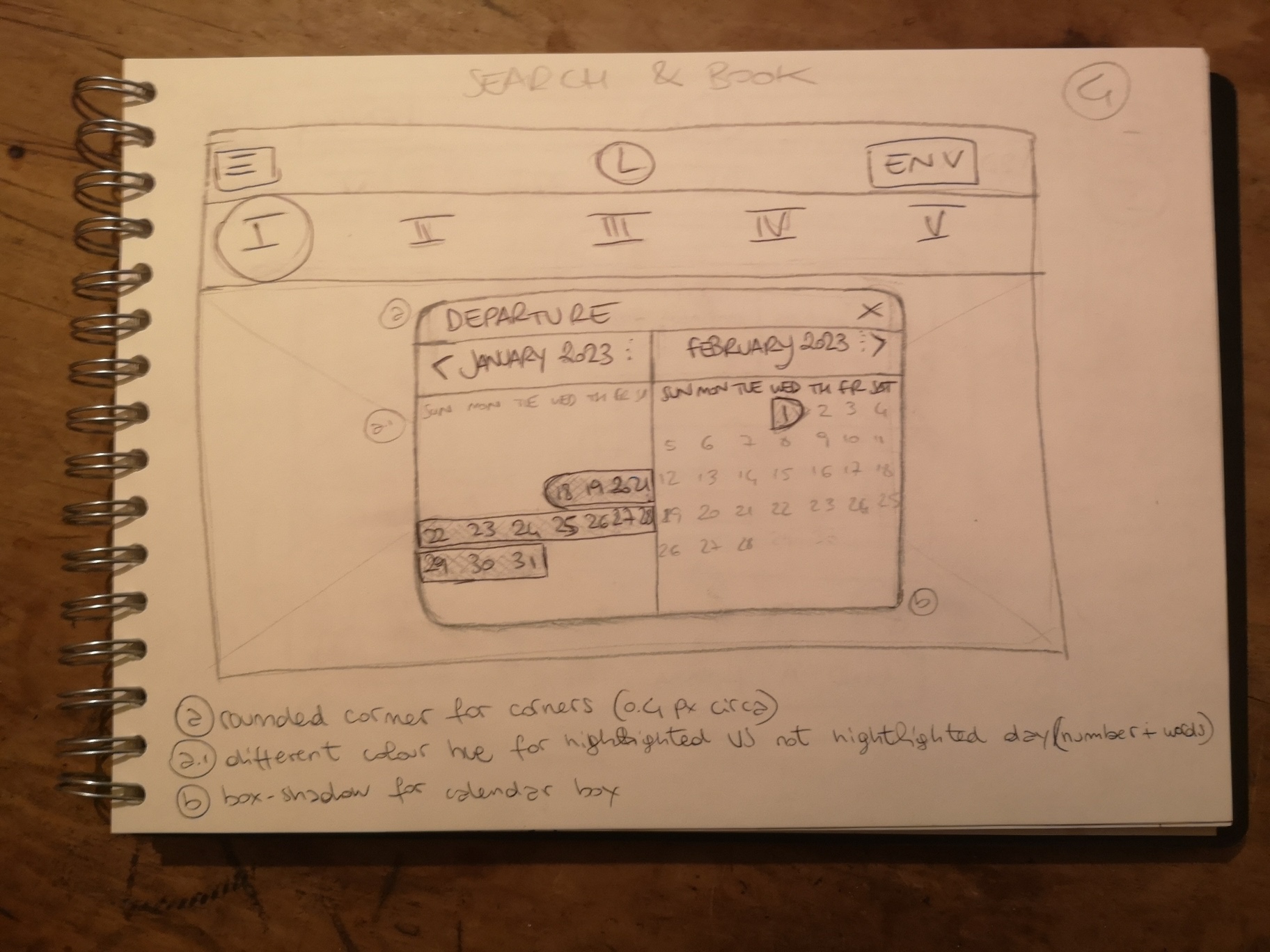
Ideation & early concepts
Early ideation explored multiple directions before committing to a single structure: different information densities, card layouts, progressive disclosure for policies, and sequencing options for add-ons.
The goal was to find the balance between enough information to feel safe and not so much that users get stuck rereading.
Process artifact
I used affinity mapping to organise patterns from research and testing, making it easier to identify where hesitation accumulated across the booking journey.
Process artifact
The journey map showed how doubt built gradually over the flow. This helped shift the design focus from isolated screens to cumulative reassurance.
Early exploration
I explored different information densities, room card structures, and sequencing options before deciding on the final direction. The goal was to balance reassurance with simplicity.
Design